Building a Project Preview Component: Layers, Motion, and Adaptation
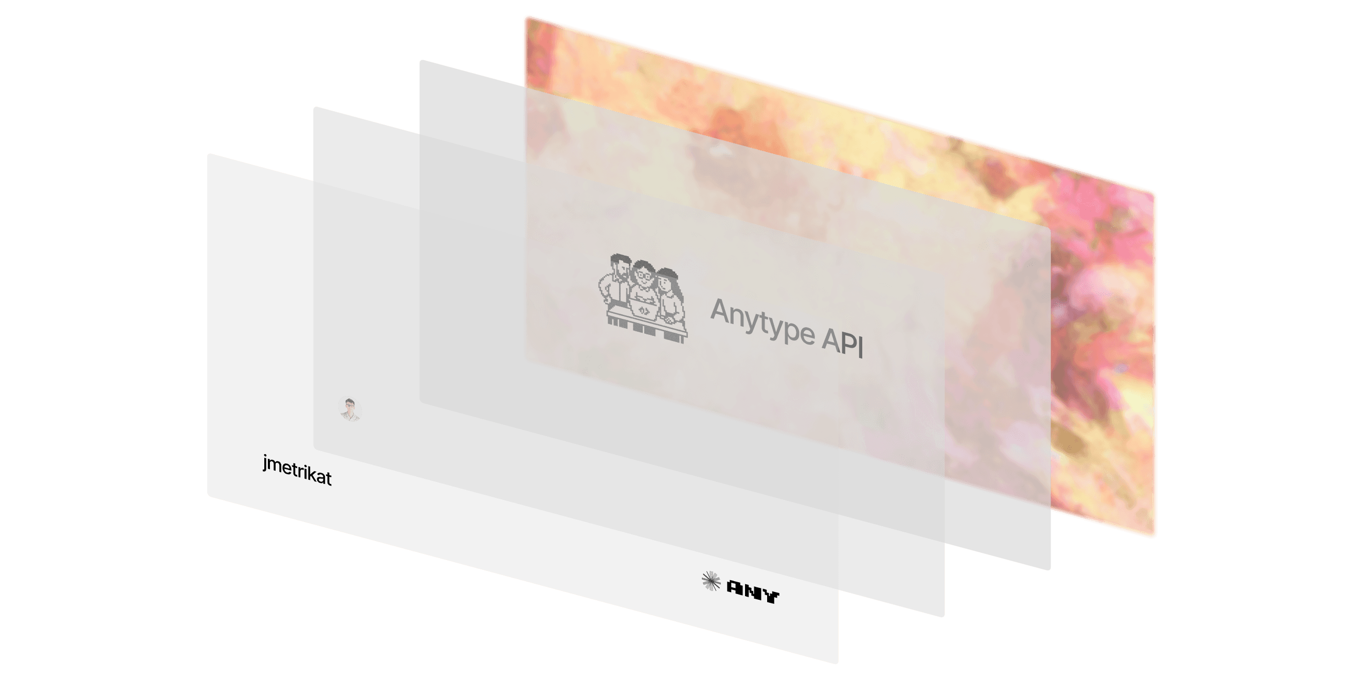
The ProjectPreview component is a static card that transforms into a focused experience on hover and tap. This post shows you how to build the layered hover effect, the morphing dialog, and how to adapt it to dark mode.
I started by optimizing for feel over features. The card stays calm when you're scanning the page and only opens up when you show intent. That meant a clean static state, a gentle tilt to suggest depth, and a hover reveal that arrives quickly but not abruptly. For the tilt, I used a modest rotation with a spring that eases in and out without wobble. The goal isn't to impress with motion - it's to show the element responds to you.
Calm by default, expressive on intent.
- Tilt that suggests, not shouts: a limited rotation with a low-bounce spring.
- Fast hover, soft fade: quick on interaction, gentle otherwise.
- Selective inversion: preserve legibility and brand intent in dark mode.
Under the hood: standard React and Next with next/image, Tailwind for styling, and Motion Primitives for the dialog and carousel. Vector assets (logos, overlays, main artwork) stay as external SVGs so they scale cleanly. Photographic content stays raster.

Layering the Hover State
Each card has three layers: a color plate, a product image, and two on-hover overlays. The layers stack on a relative container using absolute positioning and z-index so their order is explicit. I lock the frame to a 1.91:1 ratio to keep the grid quiet across breakpoints. The reveal is pure CSS - opacity transitions tied to group-hover - so there's no JavaScript on the happy path.
Here's how it's structured:
// Core trigger structure (simplified)
<div className="group relative aspect-[1.91/1] w-full overflow-hidden rounded-xl">
  <div className="relative h-full w-full rounded-xl">
    {/* Color plate */}
    <Image
      src={`/projects/backgrounds/${project.thumb.color}.png`}
      alt={`${project.name} background`}
      className="h-full w-full rounded-xl object-cover dark:filter dark:brightness-90"
      width={1000}
      height={1000}
      draggable={false}
    />

    {/* Main artwork */}
    <Image
      src={`/projects/${project.thumb.slug}/main.svg`}
      fill
      sizes="100vw"
      className="pointer-events-none absolute inset-0 object-contain dark:invert"
      draggable={false}
    />
  </div>

  {/* Overlays that fade in on hover */}
  <Image
    src="/projects/overlay-profile.png"
    fill
    sizes="100vw"
    className="pointer-events-none absolute inset-0 z-20 object-contain opacity-0 transition-opacity duration-700 group-hover:opacity-100 group-hover:duration-200"
    draggable={false}
  />

  <Image
    src="/projects/overlay-logo.svg"
    fill
    sizes="100vw"
    className="pointer-events-none absolute inset-0 z-30 object-contain opacity-0 transition-opacity duration-700 group-hover:opacity-100 group-hover:duration-200 dark:invert"
    draggable={false}
  />
</div>
Three details that make it feel right:
1. Different object-fit for each layer - The base plate uses object-cover to fill the frame. The main artwork uses object-contain so it never crops.
2. Pointer events on overlays - Overlays get pointer-events-none, which lets the card stay clickable without z-index hacks.
3. Asymmetric transition timing - Slower default opacity (duration-700), faster hover (group-hover:duration-200). That gives a soft entrance and a snappy response when you interact.
Adaptation to Dark Mode
Dark mode isn't a single switch - it's multiple decisions per layer.
Background plates - Dim slightly with dark:brightness-90 so saturated colors don't glow.
Main artwork - Apply dark:invert to maintain crisp contrast. You could create dedicated dark variants if brand accuracy matters more than simplicity.
Profile overlay (photo) - No inversion. Skin tones rarely benefit from it.
Vector logos/overlays (SVG) - Use dark:invert for consistent contrast. Inlining would enable more granular CSS theming if needed.
From Card to Focused View
Once you click or tap, the card morphs into a dialog that feels like it grows from the same layer stack. A spring with no bounce keeps the opening crisp and avoids overshoot. If there's a video, it takes center stage. Otherwise a carousel invites a quick scan. Keyboard arrow keys work out of the box.
<MorphingDialog
  open={open}
  onOpenChange={setOpen}
  transition={{ type: 'spring', bounce: 0, duration: 0.3 }}
>
  <MorphingDialogTrigger>{Trigger}</MorphingDialogTrigger>
  <MorphingDialogContent className="max-w-5xl rounded-2xl bg-zinc-50 p-1 ring-1 ring-zinc-200/50 dark:bg-zinc-900 dark:ring-zinc-800/50">
    {project.video ? (
      <iframe /* YouTube embed */ />
    ) : (
      <Carousel>{/* Images */}</Carousel>
    )}
  </MorphingDialogContent>
</MorphingDialog>
Links inside the dialog have a subtle magnetic pull. I keep the intensity low so it reads as tactile, not sticky. Focus and escape are handled by the dialog, which keeps interactions predictable.
What makes it feel fast is multiple small decisions:
next/imagehandles responsive sizing and lazy loading- Static hover states stay CSS-only, keeping the main thread quiet
- Images are
draggable={false}to avoid ghost drags - Alt text on meaningful layers, decorative overlays marked
aria-hidden - Motion primitives respect reduced-motion
Given more time, I'd make a few improvements: map brand assets to per-logo dark treatments rather than a blanket invert, make overlays more narrative so the profile layer carries context about the project rather than just decoration, and experiment with brief choreography on hover - staggered fades and micro parallax to lean into the card's cinematic frame without adding noise.
Conclusion
The ProjectPreview is a small, layered composition: fast to render, calm by default, and expressive on intent. Three patterns make this work: explicit layer separation with z-index keeps the structure easy to reason about, CSS-only hover keeps the main thread quiet, and per-layer dark mode treatments rather than one blanket solution.
Copy the code above and swap in your own images. The structure works for any layered card design. Curious if anyone's using transform animations instead of opacity transitions for the hover states - haven't tested if that performs better at scale.

